What is Grid Maker?
Grid Maker is a visual organisation tool in Scenario that assembles a selection of images into a neatly aligned grid. Rather than arranging pictures by hand, this tool lets you pick the exact number of rows and columns for your layout so you can present variations, poses or concept iterations in a single view. Similar collage tools provide full control over the number of rows and columns and aspect ratio, letting you build a grid that suits your design without starting from a preset. You can also customise the spacing and background colour between cells so the final board looks polished.
How to Use Grid Maker
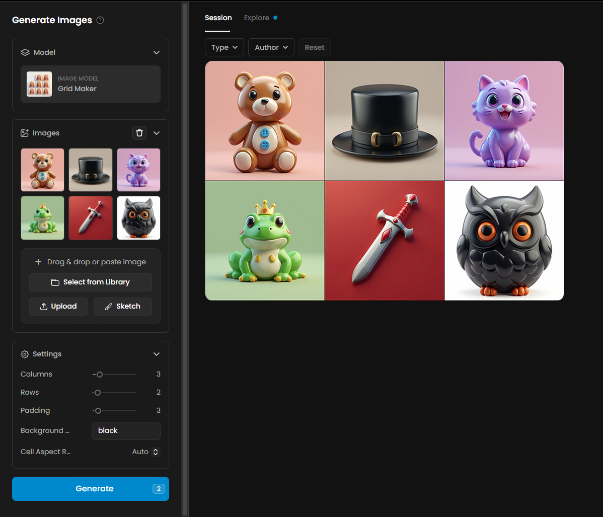
Select your images – open the tool from Tools menu and choose the pictures you want to combine. It works with product variations, character poses, concept explorations or any set of related images.
Define the layout – choose the number of rows and columns for your grid. As with other grid‑layout tools, you can type numbers directly or use arrows to adjust.
Set background and spacing – pick a background colour between cells using a colour picker and adjust the spacing slider to increase or decrease padding.
Generate – when you’re satisfied with the layout, click the generate button. Grid Maker will instantly assemble your images into a single board and display it in the content panel. Download the result or save it to your Scenario library for sharing.
Tips & Best Practices
Maintain consistency across projects. Use the same number of rows and columns for similar sets of images so that your boards feel uniform. This is particularly useful for presenting character turnarounds or product variations in a consistent way.
Consider aspect ratio. If your images have varied dimensions, choose an aspect ratio that minimises cropping. A square or portrait grid can better suit different image orientations.
Use spacing and colour deliberately. A neutral background colour and modest padding help focus attention on the images themselves. Contrasting colours can highlight particular variations.
Leverage corner rounding for style. Softened corners can give your grid a friendly feel, while square edges deliver a crisp, modern look. Pick the style that matches your project.
Practical Examples
1. Isometric Animation Spritesheet
Description
This example shows an organized spritesheet designed for isometric character animation. It contains a sequence of 12 running frames arranged in a clean grid, making it easy to import into game engines like Unity, Godot or Unreal. Each cell represents a different pose of the run cycle, allowing smooth playback when the frames are looped.

Details and Settings Used
Columns: 4
Rows: 3
Padding: 0
Frames: 12 total
Background: White
Cell Aspect Ratio Mode: Auto
2. Character Evolution Grid
Description
This example illustrates a linear visual progression of a character, showing its evolution from a basic outfit to a fully equipped high-tier version. Each stage adds new armor pieces, accessories and details, helping convey growth, improvement and narrative progression. This format is ideal for RPG upgrade screens, progression UI, or character customization previews.

Details and Settings Used
Columns: 5
Rows: 1
Padding: 2
Frames: 5 total
Background: Black
Cell Aspect Ratio Mode: Auto
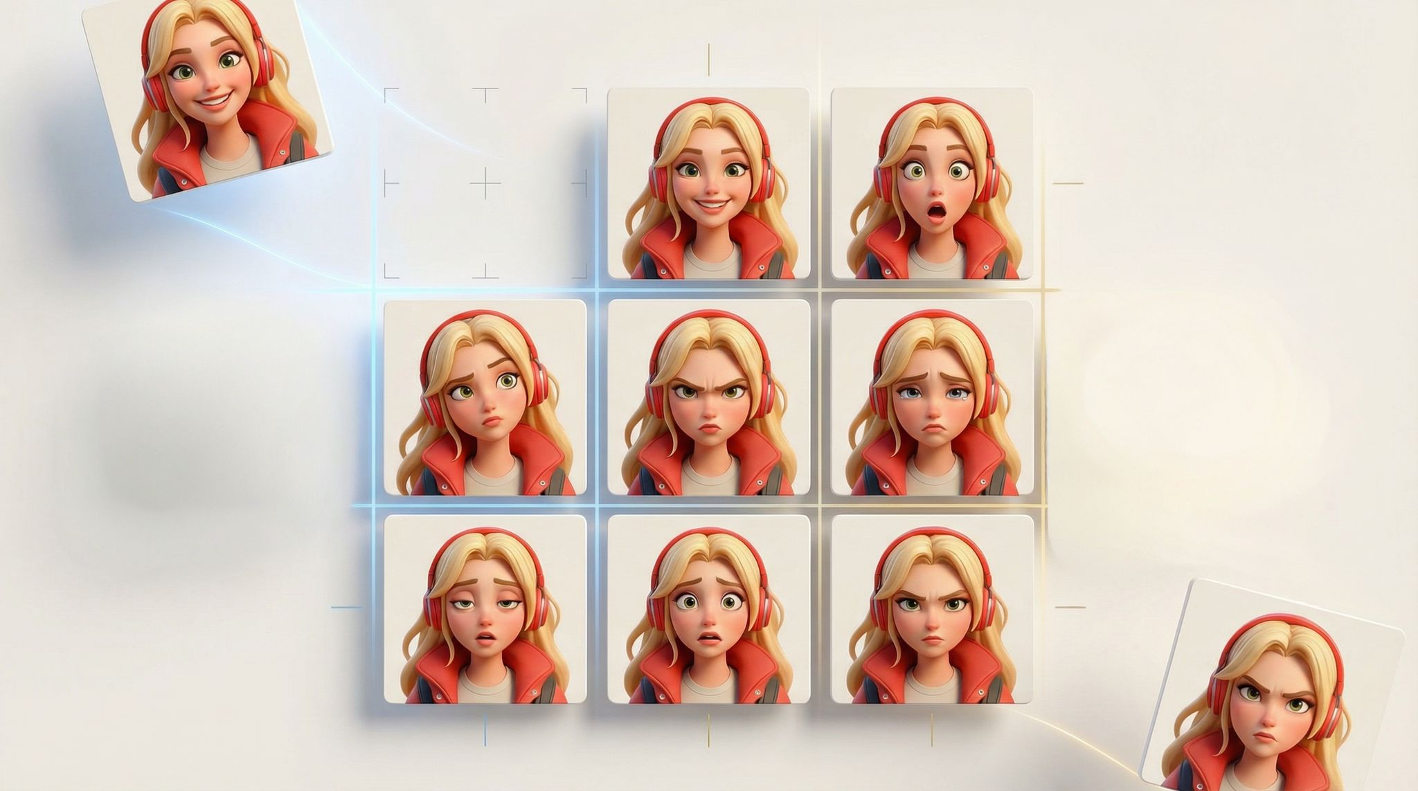
3. Expression Grid
Description
This example presents a compact expression grid showcasing a character in nine distinct emotional states. The layout makes it easy to visualize mood variations for animation, dialogue systems or character-driven UI elements. Each frame captures a clear facial expression, from joy and surprise to anger and sadness, providing a versatile reference set for storytelling and gameplay.
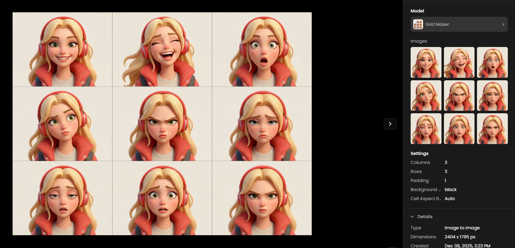
Details and Settings Used
Columns: 3
Rows: 3
Padding: 1
Frames: 9 total
Background: Black
Cell Aspect Ratio Mode: Auto
Was this helpful?